Why Data Visualization Is Key in Content Marketing Analytics

In this post I’d like to explore why, here at TrenDemon, we believe data visualization, especially in the world of b2b marketing and content marketing analytics, is a powerful component in unlocking the value of data and nurturing growth. In the previous post we discussed the impact of data capital and the importance of collecting and organizing data. This post, however, talks about ways to explore this data, gain a bigger perspective and possibly reach new ideas or insights about what’s happening and why. I’ll share some examples from our own experience in b2b marketing analytics as well as from the world of data visualization, BI and big data in general.
Data visualization can be as simple as correlating 2 charts but at the same time, yield powerful insights. So powerful if fact, it can lead to founding a whole new company. That’s what happened to us a few years ago.
Isaac Asimov said that “The most exciting phrase to hear in science, the one that heralds new discoveries, is not ‘Eureka!’ but ‘That’s funny…’. Our own moment here at TrenDemon came quite by accident in late 2013, as we decided to take a deeper look into content marketing ROI and analytics and how content impacts revenue. We were going over a list of reports from the system which plotted the relationship between certain articles’ traffic and their business performance (see below). Looking at this chart, 2 things became apparent: 1) very few articles have an impact on the company’s business goals 2) the good pages are not receiving as much traffic as pages with much lower performance rates.
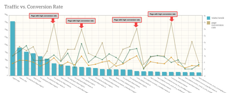
“Well… that’s funny…. There are only a handful of pages that actually contribute to conversion yet they are not the ones getting the most traffic”. Not sure if its just correlation or causation, we decided to see what happens if we drive more traffic to those pages. Would that effect overall performance?
In the chart below is what happened after we added a real time personalization unit which recommended those articles to visitors:

Viola, 400% increase in conversion rates within 42 days, automatically. After some more experiments with other companies, we could establish a causal relation between the articles people read and the likelihood of them becoming customers. That’s what set us moving to the path we are on today, and all we have is one crude chart to blame…
Data Visualization – Why it matters?
Besides our anecdotal story, it’s no surprise that visualization plays a major role in how we process and act on information. By some ‘studies’, over 65% of people are visual learners (link). In our work we come across many types of marketers. Some feel more comfortable looking at rows of data and feel right at home with an excel sheet. But, many other marketers aren’t, yet they too need better tools to explore and visualize information in order to come up with new ideas, experiments or insights.
Today, as we are drowning in big data, the default go-to answer of technologists to the problem is AI. Let’s dump the whole thing on the machines and hope they can make some sense of the mess. Yes, AI is a powerful way to correlate huge amounts of data, find connections and help generate the bigger picture but we still need to make sense and decisions from that picture. To make an analogy from autonomous cars, AI can do a great job in getting us safely wherever we want to go but its our job to define the destination. A similar transition is happening today in b2b marketing – automation replaces previous technical tasks, while the marketers role is moving towards grasping the bigger picture, the trends, foreseeing risks and opportunities and envisioning new growth channels.
Here’s a great example of “big picture visualization” by Google which released an interactive graph showing the popularity of music genres over time:
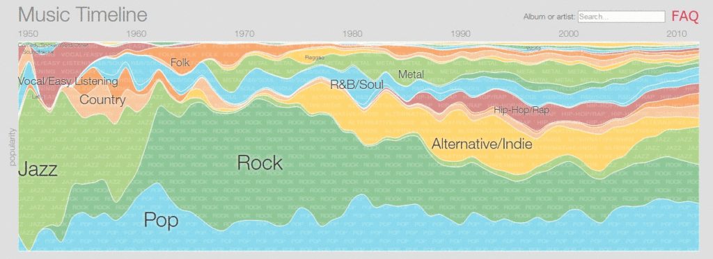
You can see general trends in music but also dive deeper into each genre and see what it is made up of. source
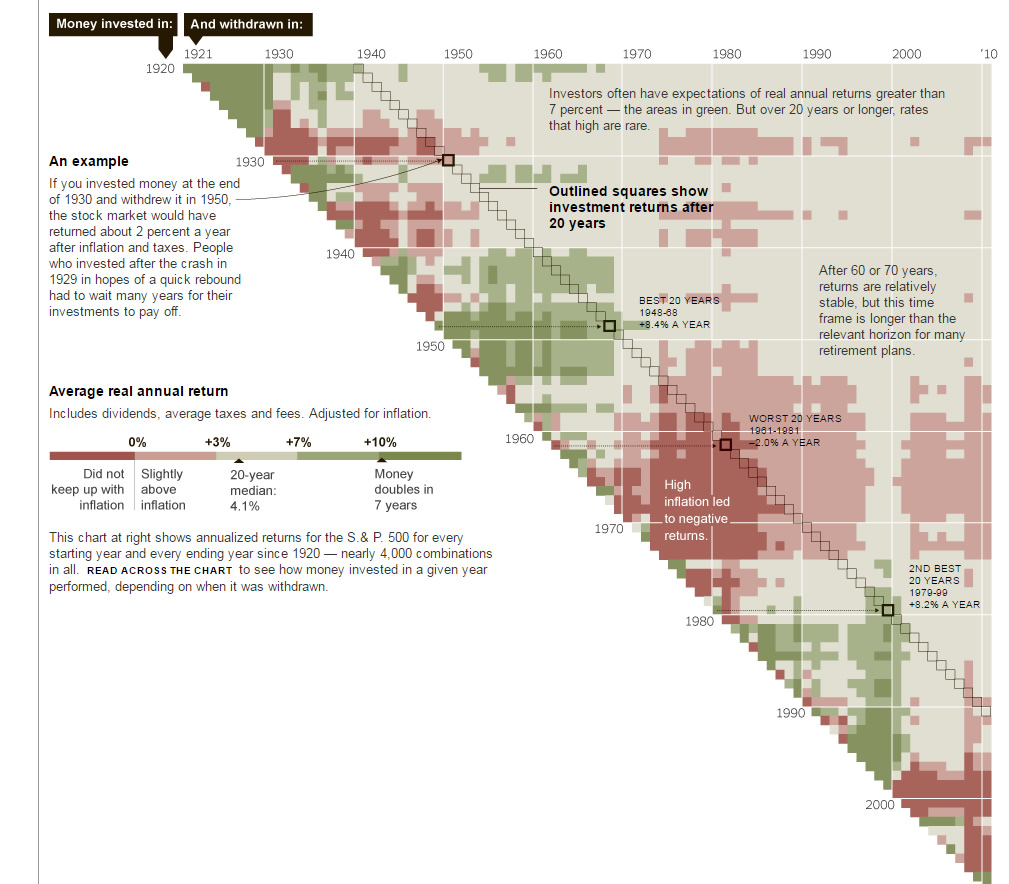
Another great “big picture” example comes from the NY Times in a visualization which looks at the investment entry and exit times (green – high returns, red – low returns which did not keep up with inflation). As they show, in investing what matters is when you start and when you finish. What’s also clear is the boom and bust cycles that the market goes through, almost in strange precision (see the alternating reds and greens).
and another great one describing the differences in IPOs between Facebook and the rest
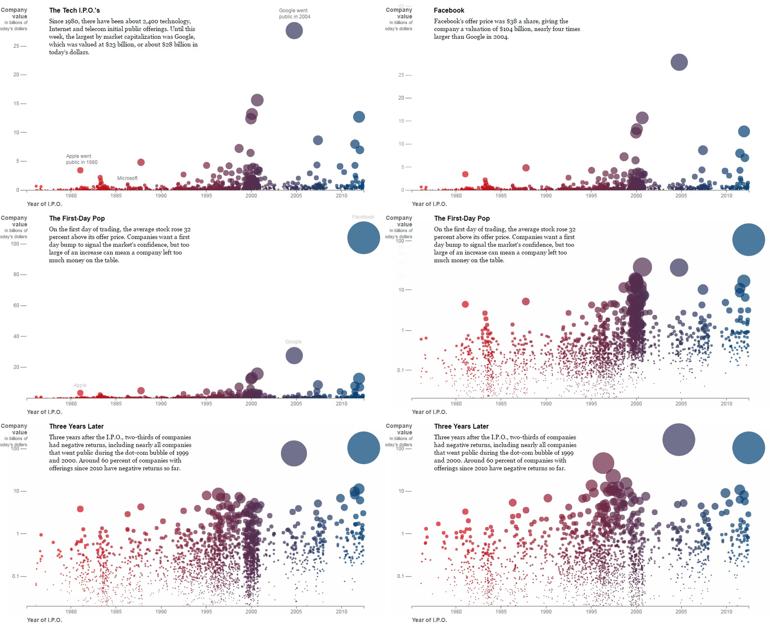
source: NY Times
For more examples of innovative visualizations, check out the amazing work of Mike Bostock’s here.
How To Leverage Data Visualization for Growth Marketing
We can use data visualization to identify issues or opportunities in our growth machine, but first, we need to collect and organize the data in a meaningful way. For more on how to do this and the role of big data in b2b marketing, check out our previous post on the topic – link.
Let’s look at content marketing analytics, for example, and how visualization can help identify opportunities there more quickly.
Content Performance Visualization
One of the basic questions b2b content marketers ask is how effective is my content in relation to my business goals. The answers help in determining what to promote and which topics to write about next. In the next example, you can see a bubble chart which places the posts on grid and describes 3 parameter for each post: traffic, conversion score (how many times it participated in the customer journey) and number of conversions.
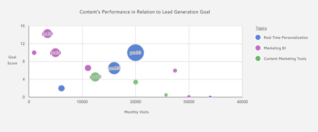
In the example above you can see how different topics perform, as well as which individual post perform best and should be actively promoted. This chart can also be interactive and played over a timeline to show performance trends over time. The can help predict which posts or topics are trending and help in assessing future performance levels. Although TrenDemon automates the process which creates these types of insights, you can generate similar charts with also with excel.
Source Performance Visualization
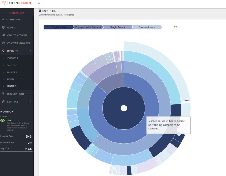
Another question which many marketers deal with daily is which sources generate the best ROI. This question is especially tricky in b2b marketing due to the long customer journeys and multiple touch points which require deploying attribution models or at the very least look at the source of the first touch of the journey. Here we can use an example of an interactive chart we use to navigate between various user groups and see from where they initially came, as well as which channels and campaigns yielded the best conversion rate. The pie describes the distribution while the different colors indicate performance levels of each source or campaign. It allows you to visually spot top performing sources as well as drill down to see the individual campaign level:
Conclusion
As we tried showing above, in order to transform the overwhelming amount of data we gather into insights, we also need to get creative with the ways we visualize it. If in the past this was the domain of BI specialist, in our current age of data, this is a skill more and more functions in the organization have to become proficient in.